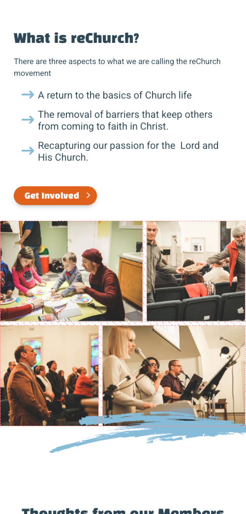
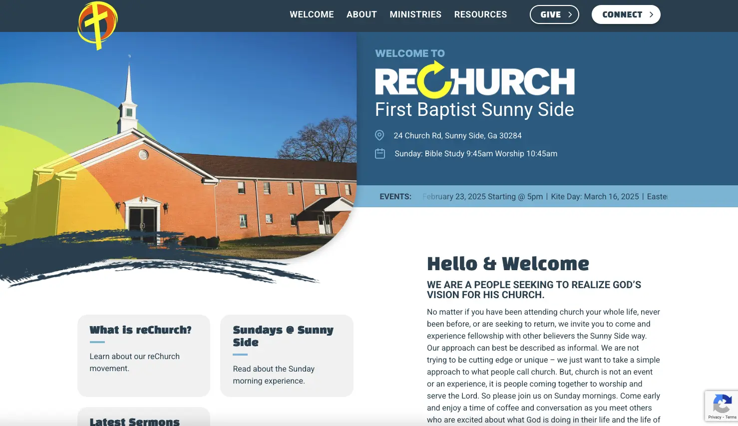
This was honestly a fun site to build. My first church site and even though I’ve never attended, through the imagery and the content of this site I felt a warm connection with it’s parishioners.
Right away when viewing the Figma design for this site there was a section that stood out to me;
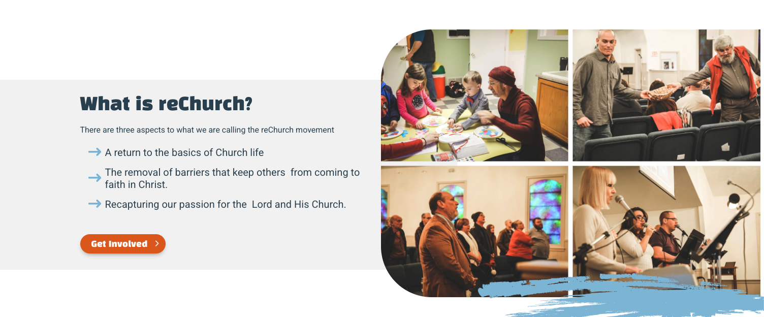
You have a content section on the left with a background color that doesn’t span the full height of the section or appear behind the image grid. Also it is within the container of the site. Then you have the image grid to the right that extends out of the container and is fixed to the right side of the screen.
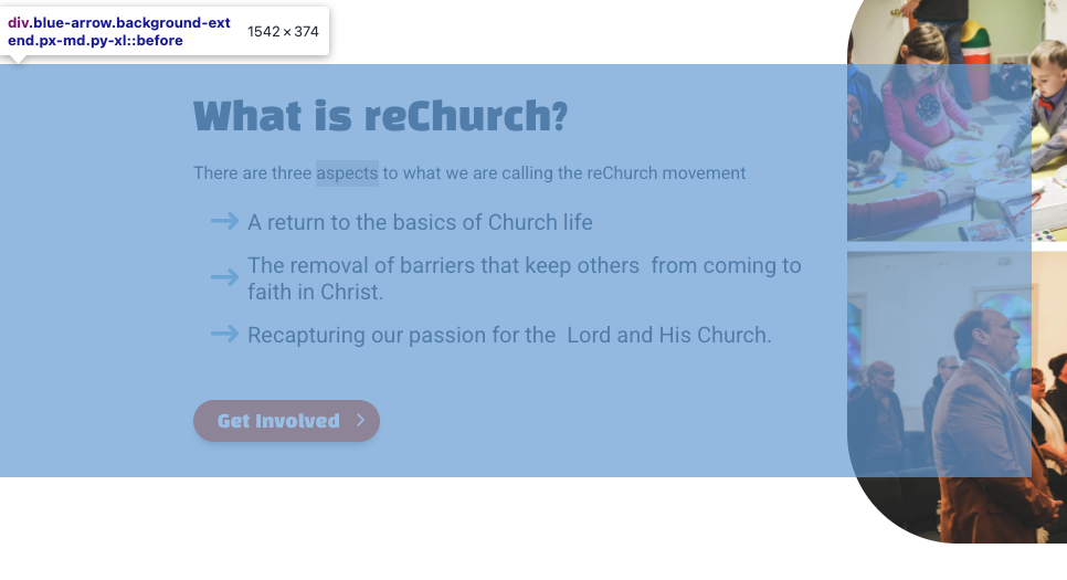
The first thing I did was wrap the content area in a div, and give that div a psuedo element of before, and give it a full width, then move it 50% to the middle of the section. This section is inside of a container, as well as a flex parent with 2 50% flex columns so that it can keep its responsiveness.
.background-extend::before {
    content: "";
    position: absolute;
    top: 0;
    left: 0%;
    width: 100vw;
    height: 100%;
    transform: translateX(-50%);
    background: #F3F3F3;
}
Next, I created an image grid then pulled it outside of it’s container
.image-grid {
    gap: 8px;
    display: flex;
    flex-wrap: wrap;
    position: relative;
}

@media (min-width: 1280px) {
    .image-grid.image-full-right {
        width: calc(98% +(100vw - 1240px + 1.5rem) / 2);
    }
}
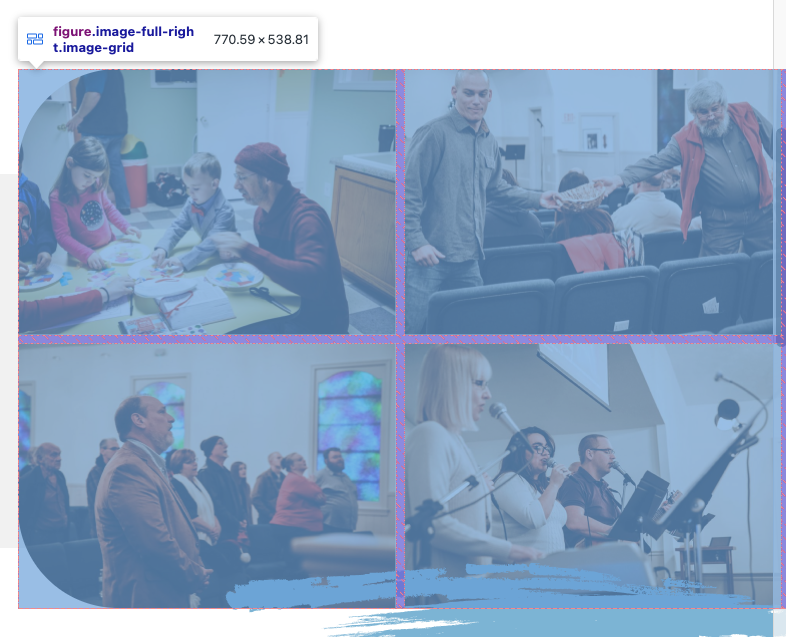
The final product came out looking very good, as well as was able to break down to mobile very easily.
